Kitchen Colours

MORE THAN JUST COLOUR
Colour is one of the most important elements in your home & directly affects your kitchen design. It has the power to transform your mood & reshape your perception of the space. Whether you're aiming for a classic kitchen design or a sleek modern design, the right colour scheme is crucial.
Understanding colour is made easy with tools like colour wheels, which help in selecting the perfect palette for your kitchen. Every colour consists of three primary attributes: hue, which identifies its position on the colour wheel; intensity, determining how bright or subdued it appears; & tone, which describes its lightness or darkness.
Talk to our designers to learn about our range of colours, materials, & ideas for your kitchen.

RELATIONSHIP OF COLOURS
When selecting the colours for your kitchen you want to select colours which are pleasing to the eye. You need to take into account the current colour of your home & you should select a colour palette that matches this. You can use the colour wheel to help you select more harmonious colours.
-
Complementary colours are opposite each other on the colour wheel. This high contrast creates a vibrant look, especially when used at full saturation. This colour scheme must be managed well to avoid it becoming jarring. Complementary colours are sometimes tricky to use in large doses, but work well when you want something to stand out.
-
Analogous colours are side by side on the colour wheel and are often found in nature. They are harmonious and pleasing to the eye.
When choosing an analogous colour scheme, make sure you have enough contrast. We suggest one colour to dominate and a second to support. The third colour should be used (along with black, white, or grey) as an accent. -
A triadic colour scheme implements colours that are evenly spaced around the colour wheel. This approach often results in vibrant harmonies, even when using pale or less saturated versions of your chosen hues. Balance is key in a triadic scheme: opt for one colour to take a dominant role, while the remaining two serve as complementary accents.
-
Warm colours, known for their vivid and energetic qualities, have a tendency to appear closer in a space. In contrast, cool colours often convey a sense of calm, creating a soothing and tranquil atmosphere.
White, black, and grey are traditionally regarded as neutral tones, providing a balanced backdrop for both warm and cool colours.

KITCHEN COLOUR INSPIRATION
Colour inspiration can be found in the most surprising places. Gather examples of colour palettes & combinations to bring to your consultation with a Smith & Smith designer. Together, we can explore integrating these into your kitchen design.
Places to gather inspiration:
Visit our showroom to get a sense of how colours interact with various surfaces under lights.
Embrace the outdoors, capturing inspiring colours in nature through photography.
Collect paint swatch cards from your local hardware store for tangible colour references.
Create & curate boards on Pinterest for a visual collection of ideas.
Organise a dedicated folder on Instagram to save your favourite colour schemes.
Use screen captures on your phone or computer to collect images from the web that spark your interest.
THE THREE FUNDAMENTAL COLOUR CATEGORIES
PRIMARY
Red, Blue, Yellow - These are the foundational colours.
SECONDARY
Orange, Green, Violet - Created by mixing primary colours together.
TERTIARY
These are formed by blending a primary colour with a secondary colour.

COLOUR THEORY

Decorating with purple can create an illusion of grandeur. Lavender is lovely in a baby’s nursery and you could easily try a rich eggplant for a feature wall in your living area.

Reds can create a wonderfully warm, passionate feeling with a hint of excitement, and are renowned as a colour of strength and power. Red works wonders as a dramatic entrance colour or in a formal or contemporary dining or living area.

Blues can give a tranquil, serene feeling and sense of spaciousness. Blues are calming and help us think of our environment.

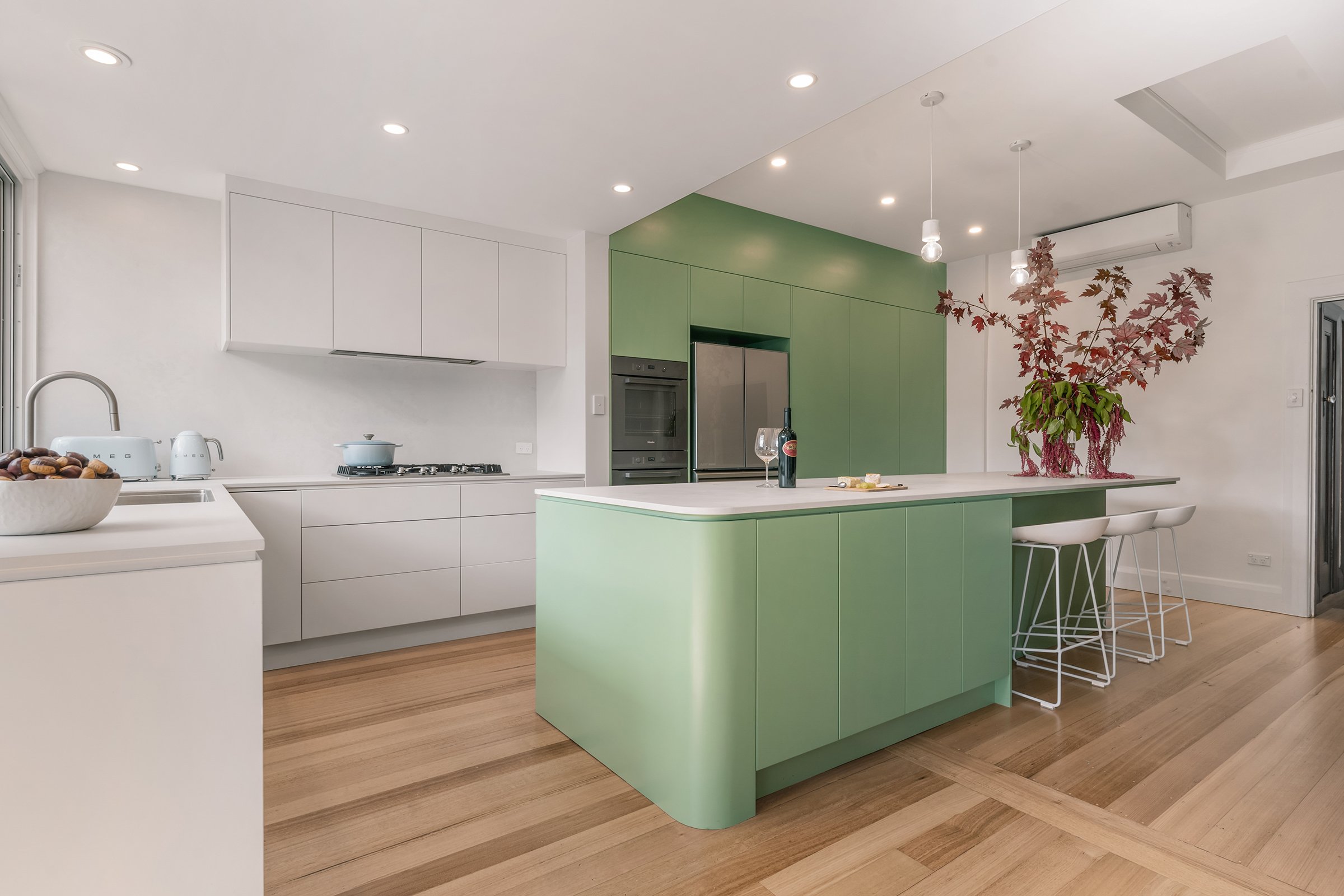
Relaxing and restful to the eye, greens create a cool, fresh and calm atmosphere. Greens come in many shades and can be lime, mint, citrus, or teal.

Yellows can create a happy, sunny feel and will make the room appear brighter. Yellow radiates warmth and is a reflective colour.
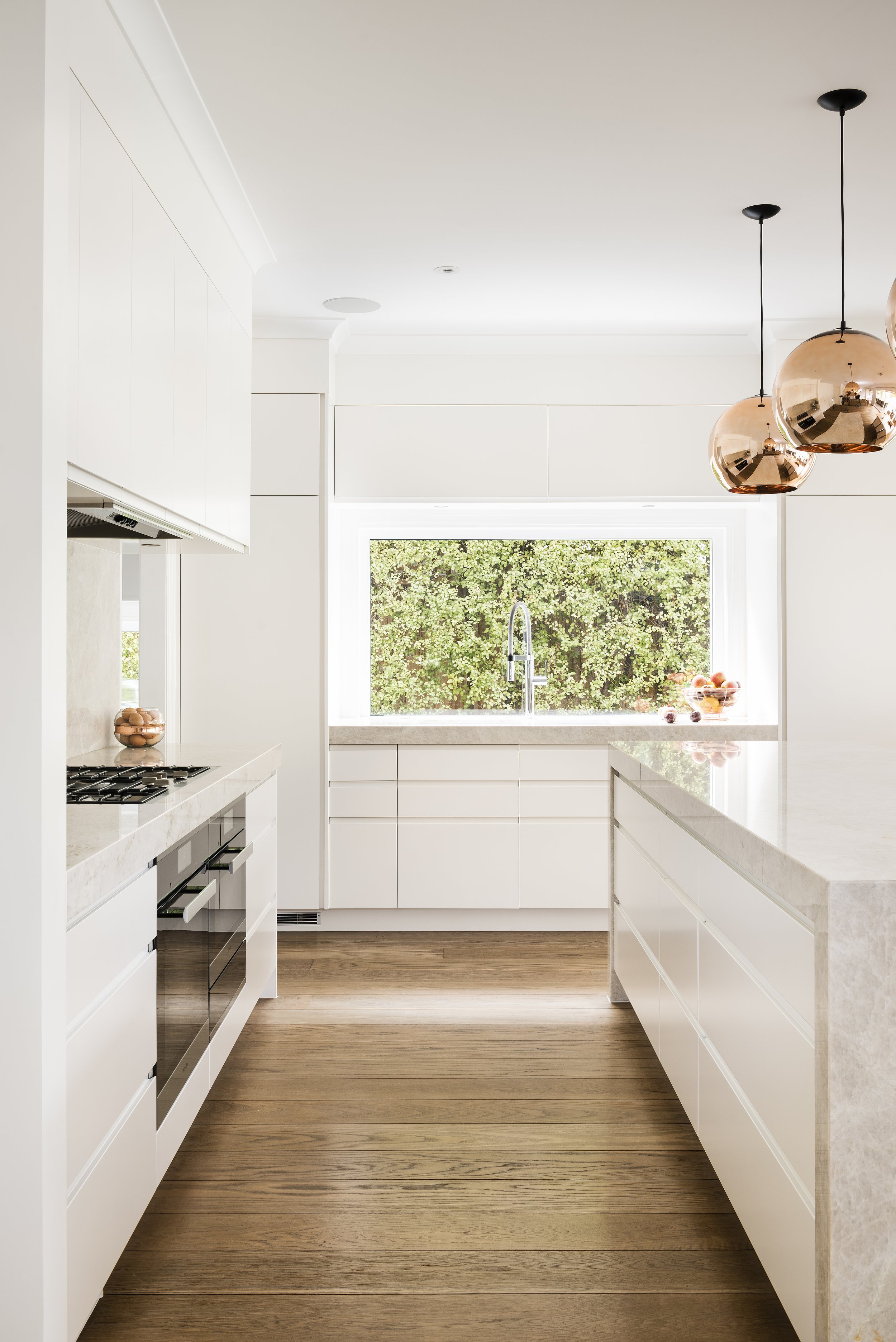
Whites and neutrals are ideal for creating a clean, classical backdrop and will allow you to add a splash of your favourite colour to any space. You have options of cooler or warmer whites and neutrals, such as greys, beiges, tans, creams and coffees.