Stress-Free Family Kitchen Renovation
3 Design Moves to Reduce Daily Chaos
For a growing family, the kitchen isn’t just a room – it’s mission control. It’s where you pack lunches, sign permission slips, answer emails, referee arguments and try to make something vaguely nutritious for dinner. When the space isn’t working, it quietly adds to your mental load every single day.
Two recent Smith & Smith projects – WITNEY and CLARE – show how a family kitchen can be reshaped to ease that load rather than add to it. Both were designed by Smith & Smith designer, Beth for busy families who wanted beautiful spaces, yes, but mainly they wanted their homes to feel calmer and perform under pressure.
At Smith & Smith each kitchen is designed around one family’s routines, then custom-built with space-specific problem-solving by our factory team in Rowville.

Two families, one shared wish: less chaos, more calm
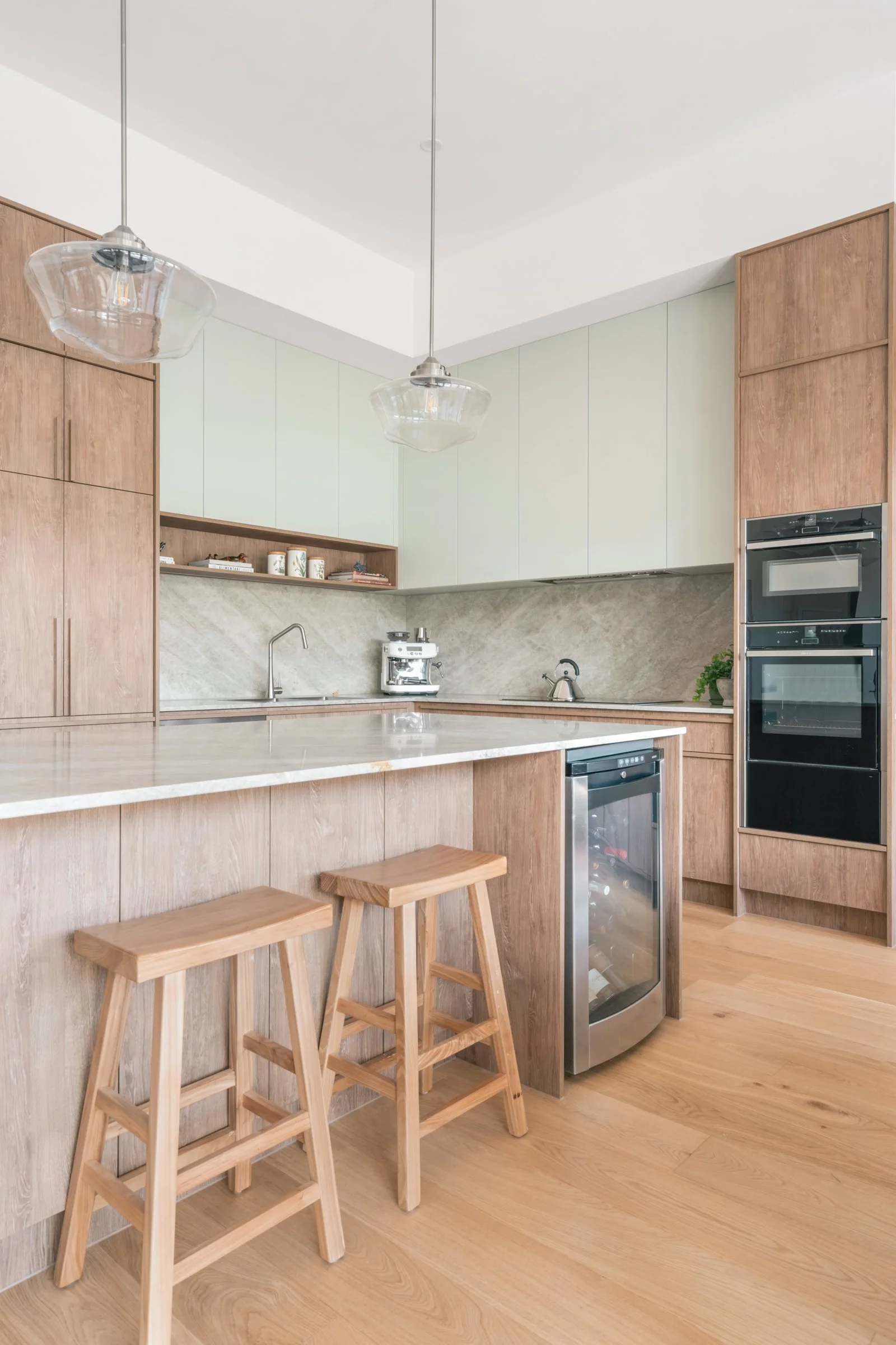
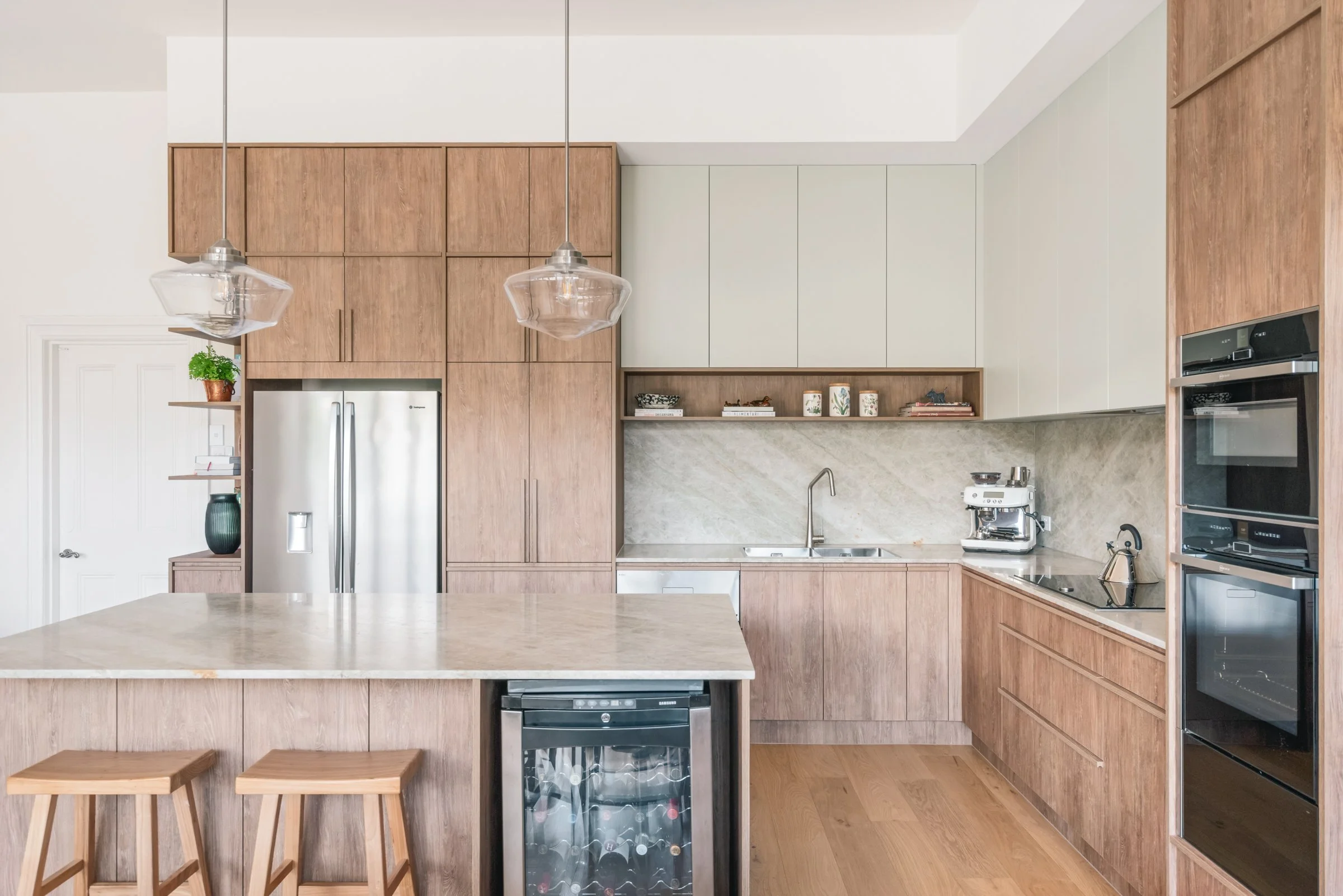
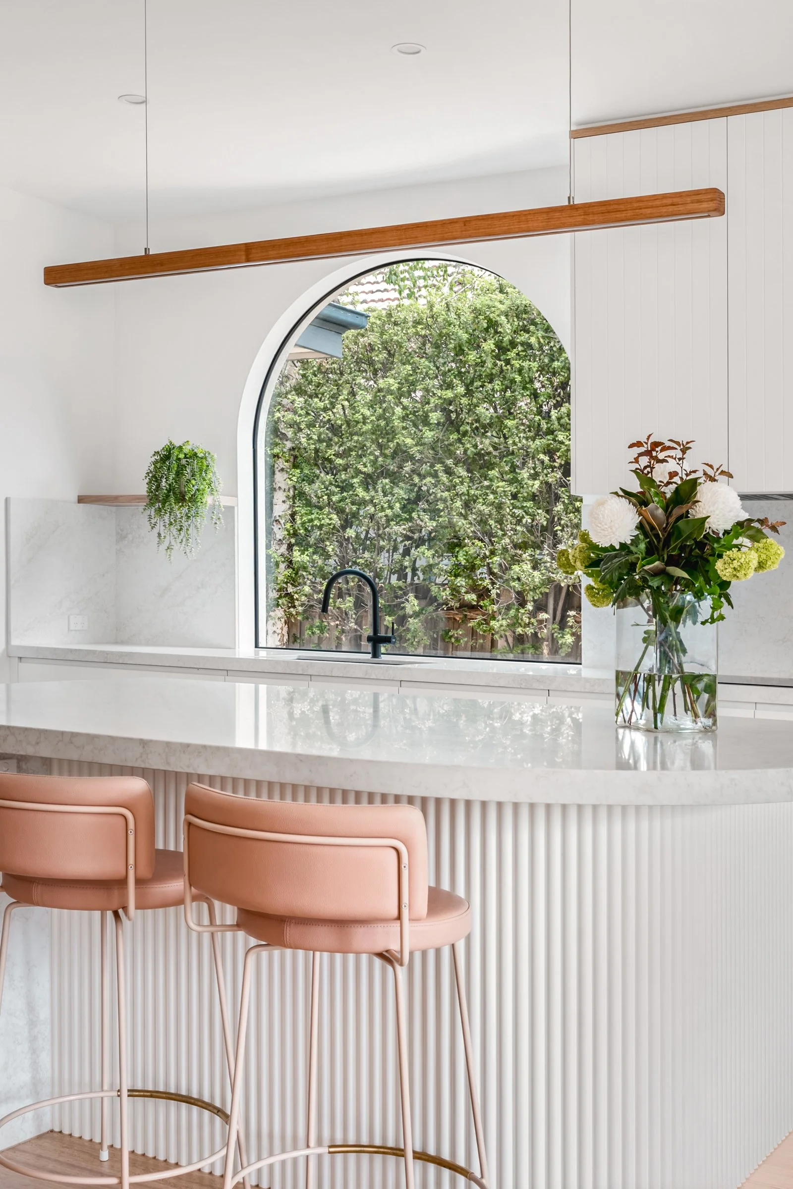
In WITNEY, the existing kitchen had all the classic stress triggers: dated finishes, a fussy dropped ceiling, too many steps in the cabinetry and a tiny sink window. Even when everything was tidy, the room still felt busy. The butler’s pantry had turned into a storage zone for “stuff that didn’t have a home” rather than a place that actually helped with mornings and evenings.
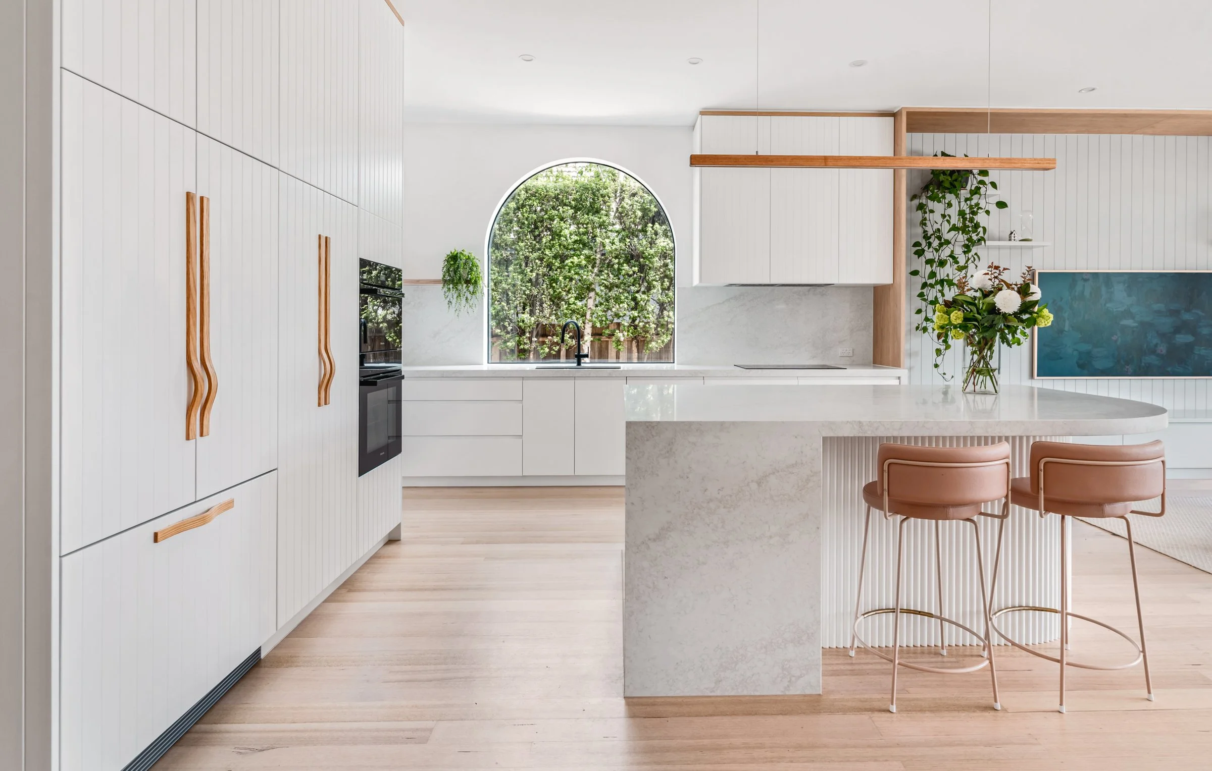
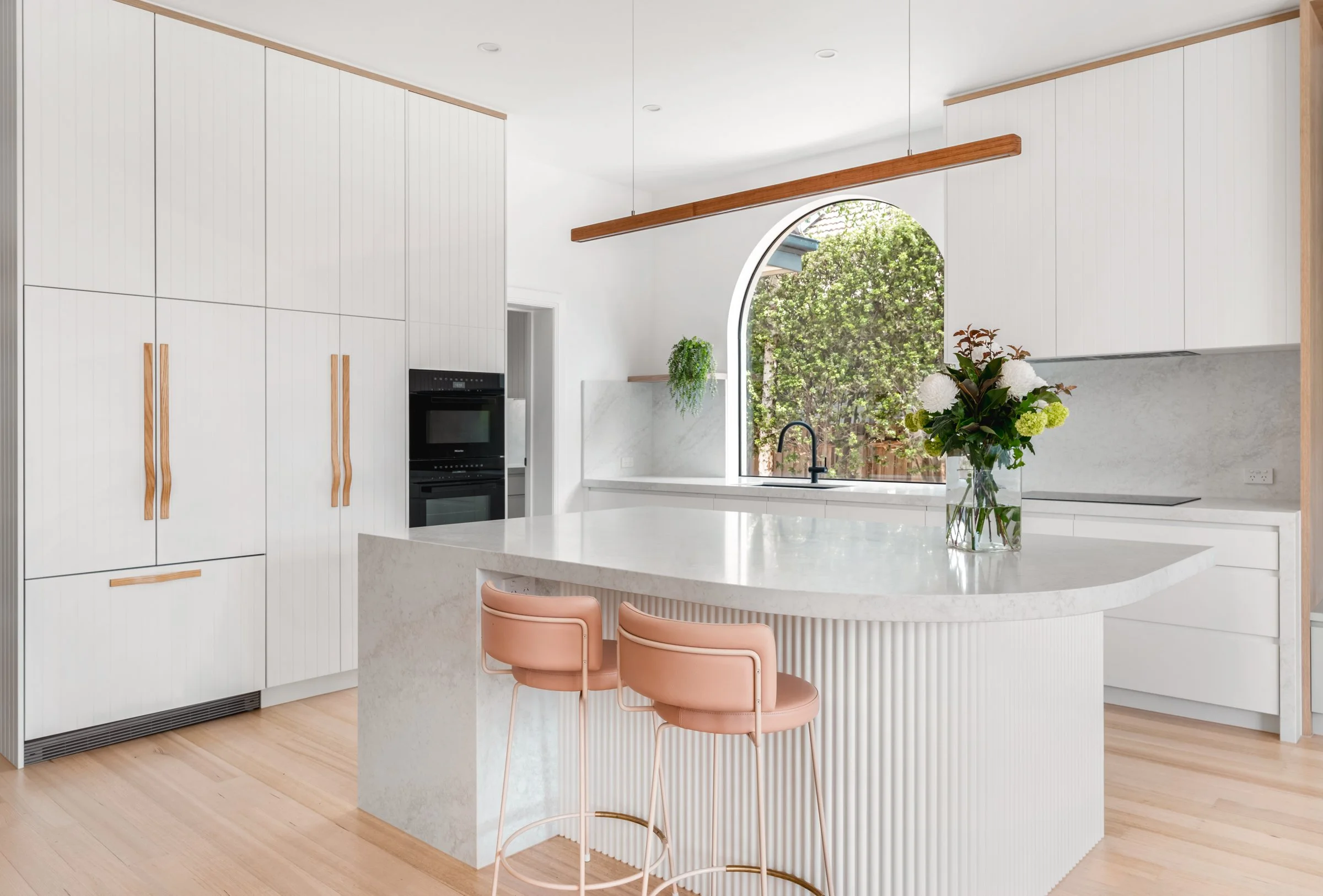
In CLARE, the kitchen and dining space sat right at the heart of family life – visible from the lounge, the outdoor area and the table. The cabinetry was traditional and worn, the flow wasn’t keeping up with how often they entertained, and the dining area didn’t feel anchored. Every time this family sat down, they were looking straight at a space that reminded them of jobs to be done.
Both families wanted to move away from feeling frazzled and behind, and towards a sense of ease – a kitchen that looked lovely from every angle and quietly supported the pace of family life.
Design move 1: Calm the way people move
The quickest way to drain your energy is a layout that creates traffic jams.
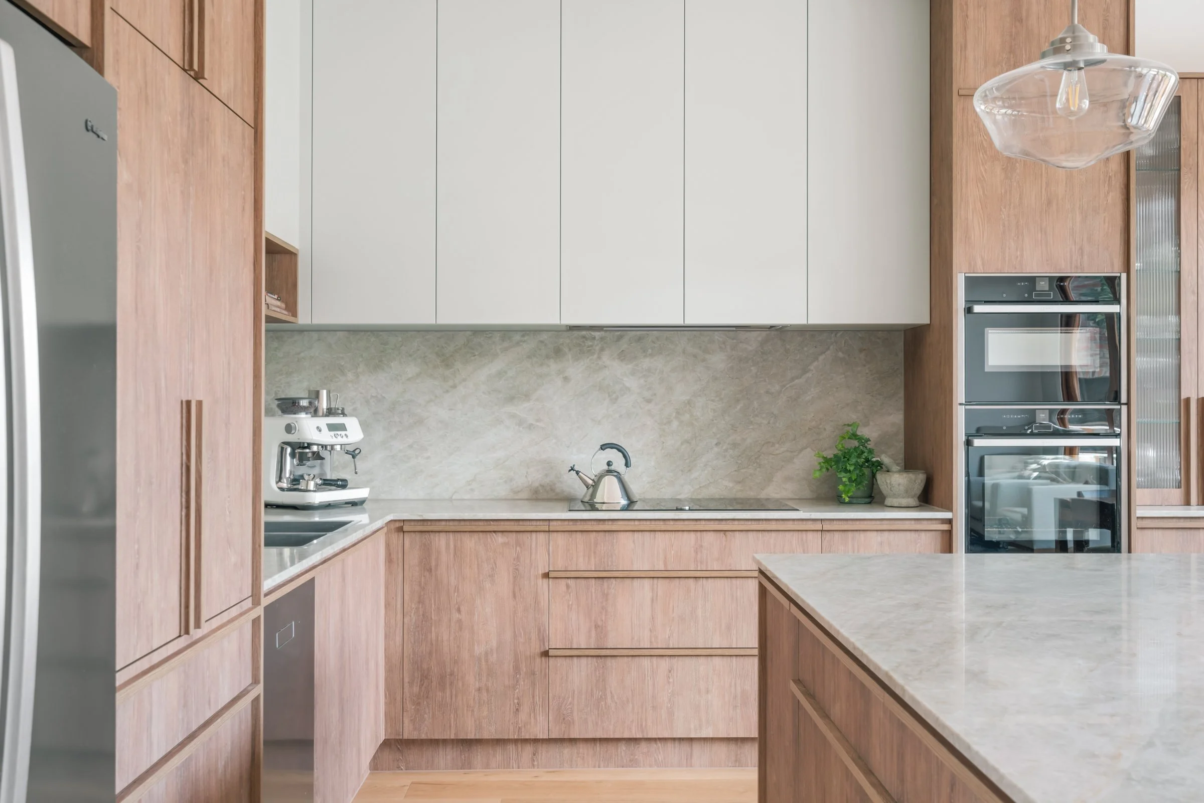
In WITNEY, Beth consolidated the fridge, ovens and tall storage into one block and freed up a long, continuous stretch of benchtop where the cooktop and sink now sit side by side. The fridge was nudged closer to the pantry so kids can grab snacks and drinks without marching through the cooking zone. Suddenly, you don’t need to zig-zag across the room to do simple tasks; everything you need for meal prep sits within a few steps.
In CLARE, a simple but powerful swap made a similar difference. Moving the sink closer to the fridge and pantry, and letting the benchtop run uninterrupted between the oven tower and pantry, turned a slightly awkward space into a clear, logical circuit. Add a bin in the island – within easy reach for everyone – and clean-up stops being a separate battle and becomes just another smooth step in the flow.
When the room isn’t making you say “excuse me” every five seconds, you feel less like air-traffic control and more like the person actually cooking the meal.
Design move 2: Hide the chaos, keep the ease
Real family kitchens will never be perfectly minimalist – and they don’t need to be. The trick is giving everyday life somewhere to land that isn’t the main benchtop.
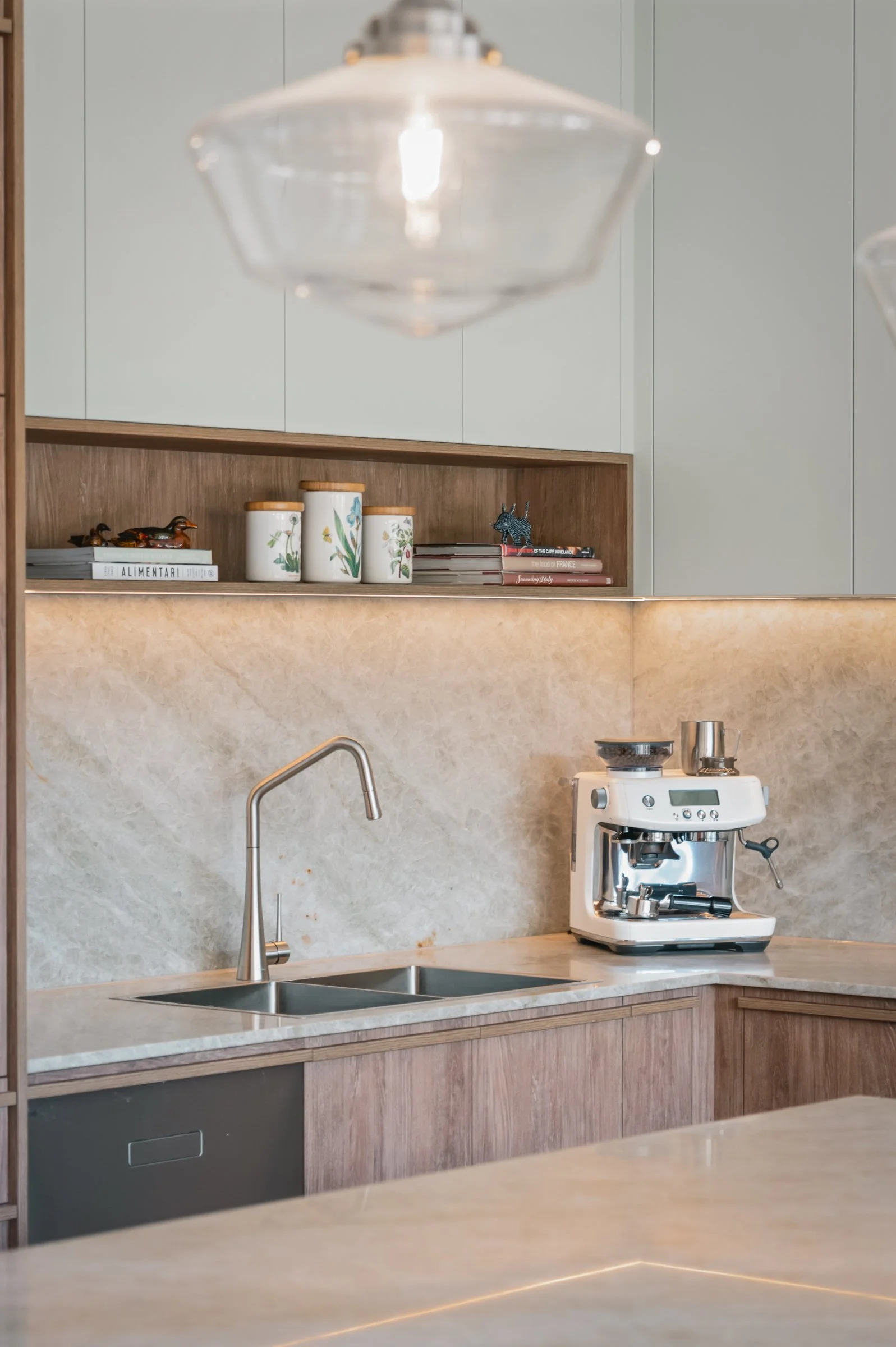
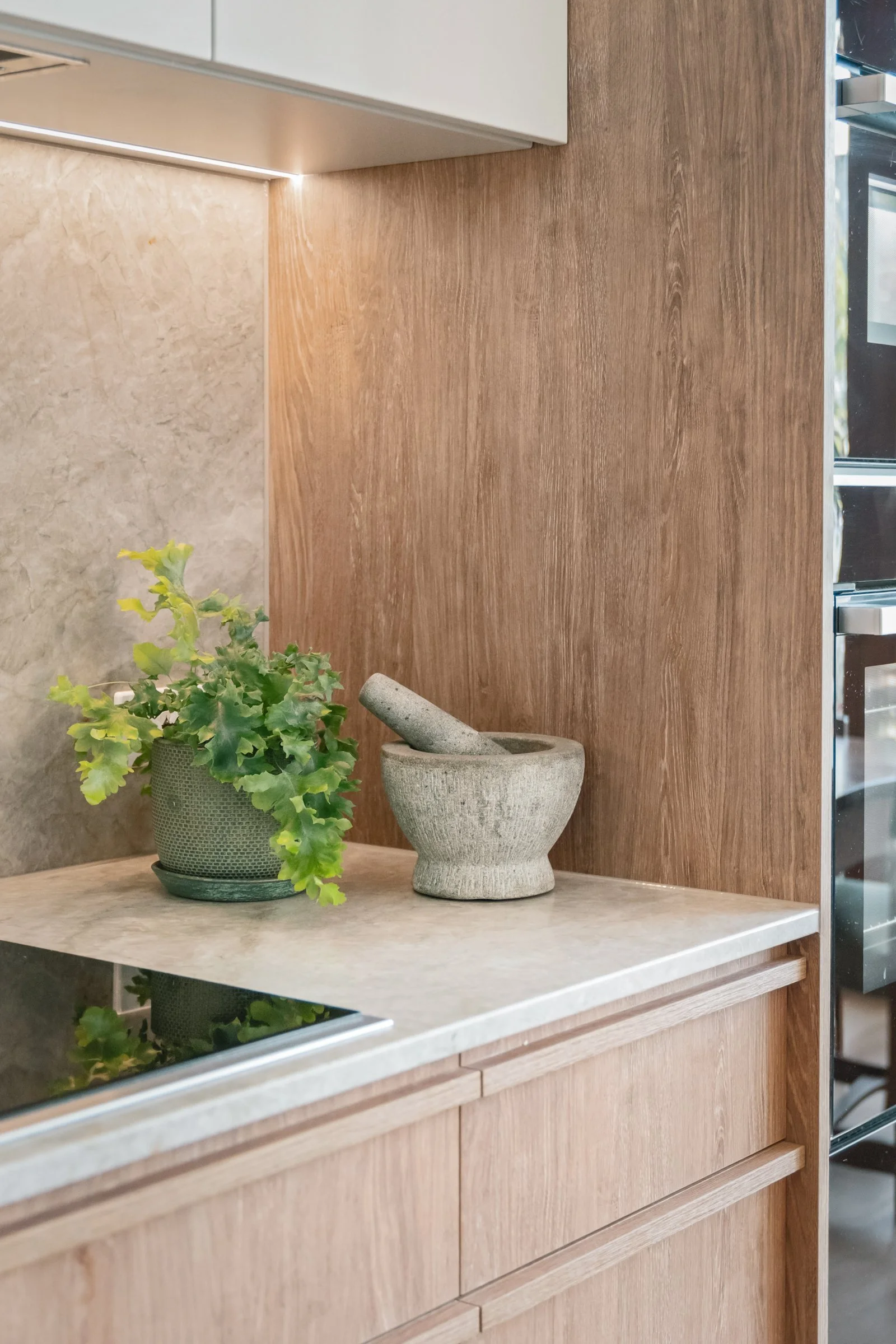
In WITNEY, the butler’s pantry was transformed from a clutter zone into a genuine workspace. It now holds a coffee, tea and drinks station plus generous bench space, so the main kitchen can look composed even when life is at full tilt. Doors close over the parts you don’t want to see; open shelves around the corner keep frequently used items within reach. A slim cargo pull-out beside the cooktop keeps oils and spices exactly where you instinctively reach for them, and a dedicated home for the robo-vac means the house can quietly look after itself in the background.
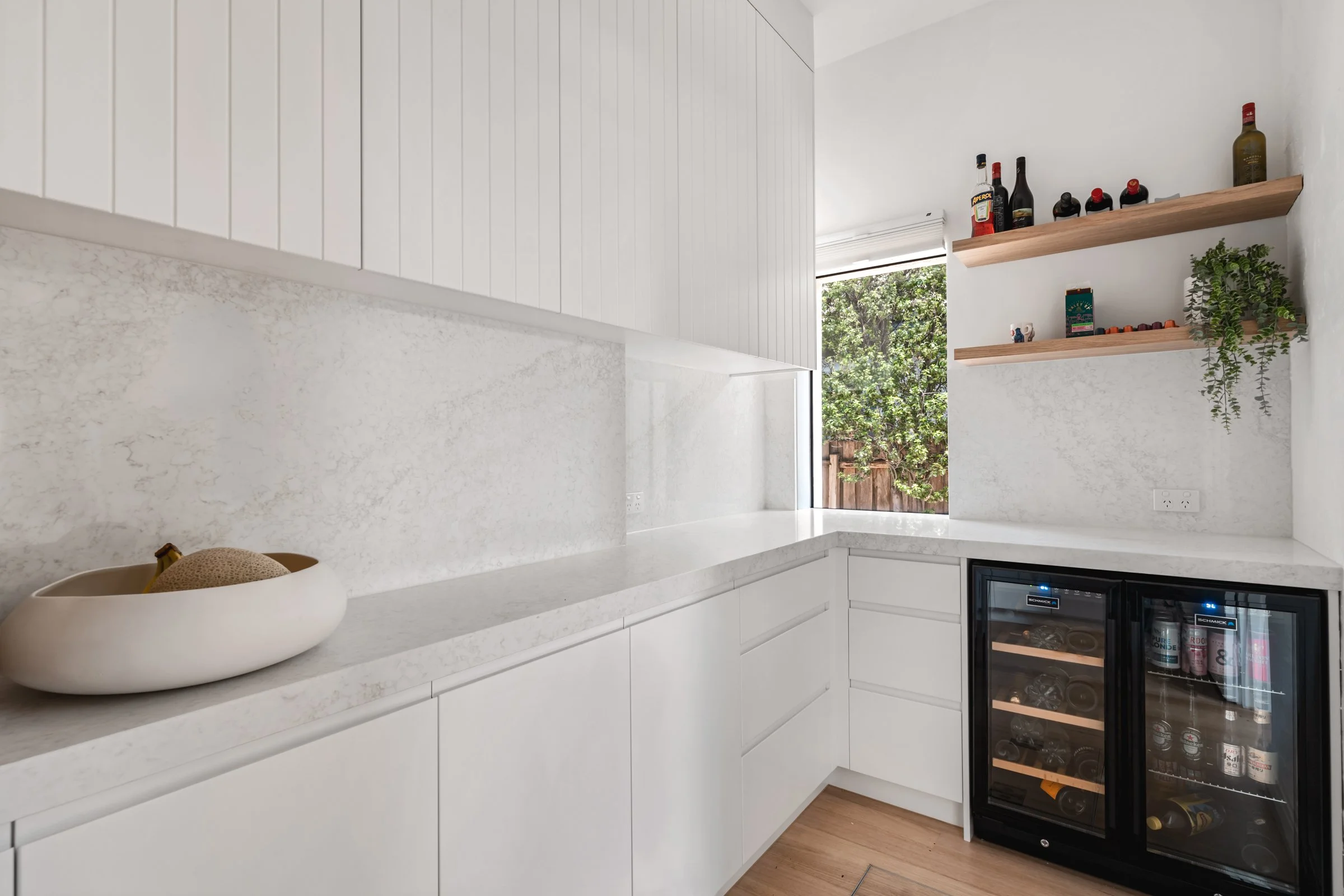
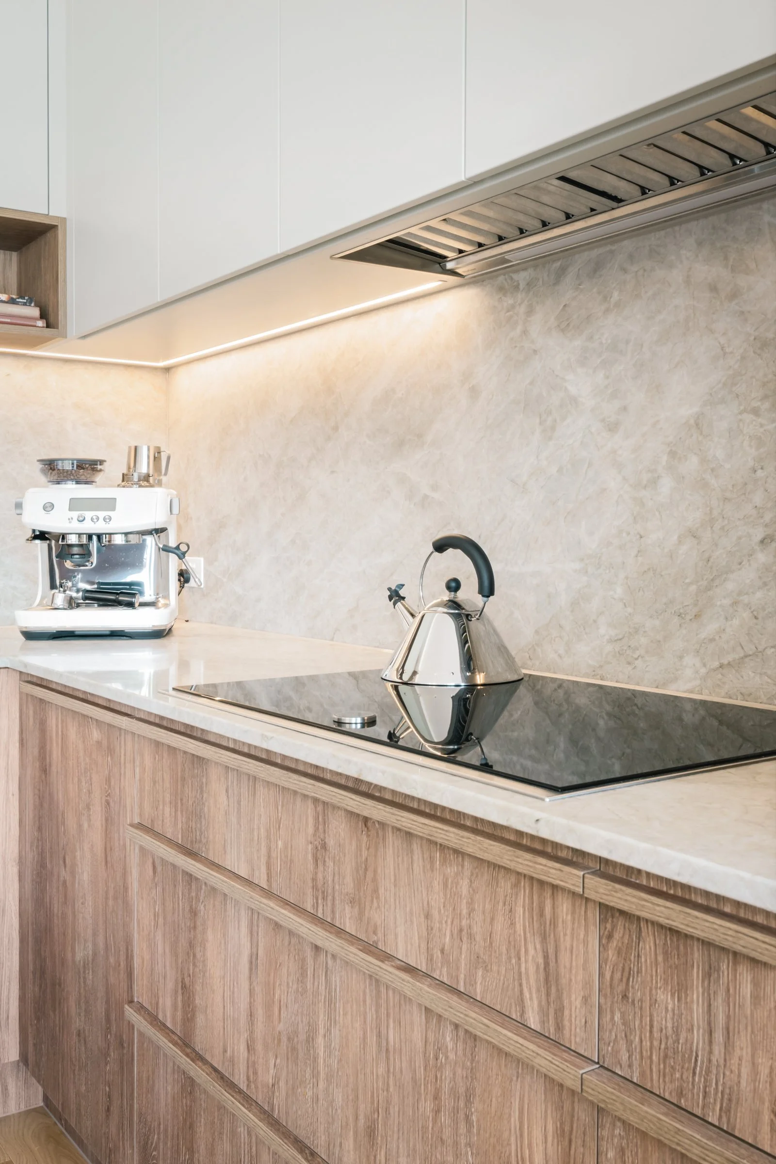
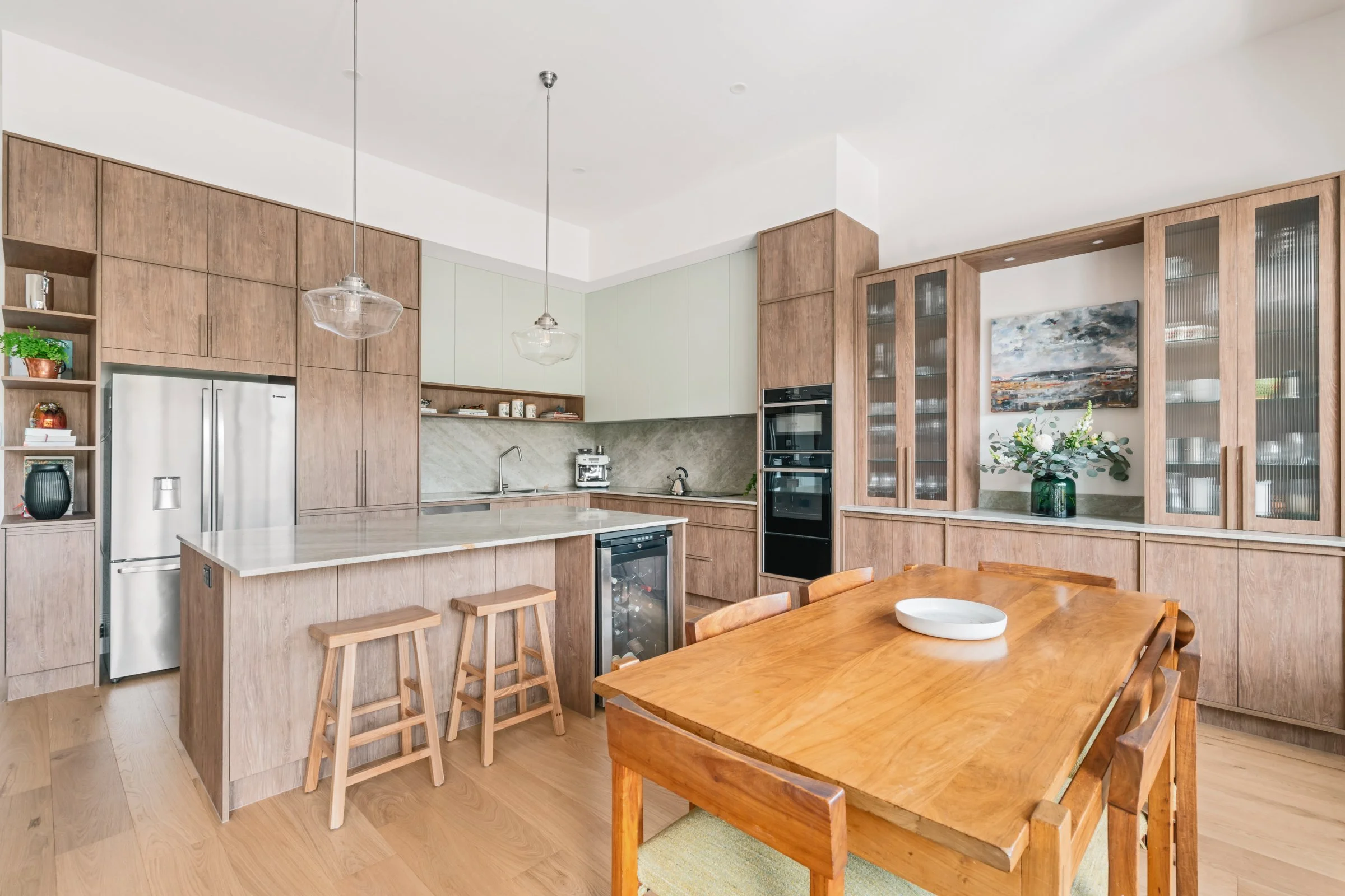
CLARE uses a different language but the same idea. Inside the sleek cabinetry, well-placed inserts and dividers keep pantry items, spices, cookware, bottles and wine organised instead of roaming. The pantry itself became slightly smaller to make room for more bench space and a double sink, but with thoughtful shelving it still does its job for a three-bedroom home – and the visible areas feel lighter because they’re not overloaded.
This is the kind of storage that doesn’t just “hold things”; it actively reduces decision fatigue and tidy-up drama.
Design move 3: Make the kitchen feel like furniture, not a work site
For many mums, the kitchen is never really “out of sight”. You see it from the sofa, the garden, the dining table. If it looks harsh or busy, you feel it.
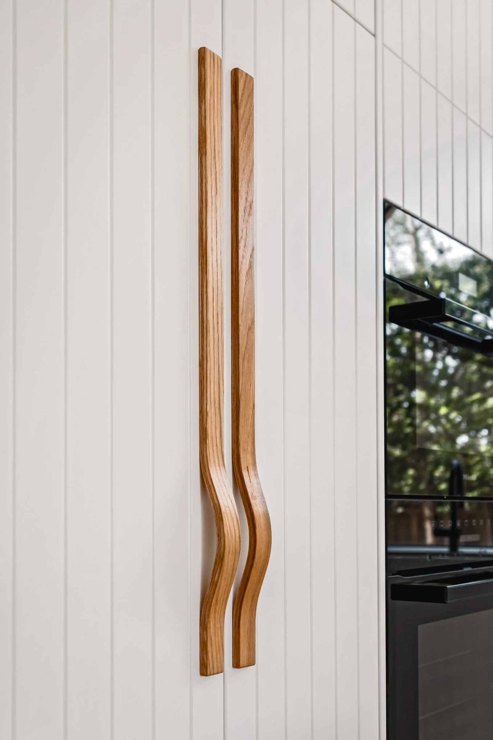
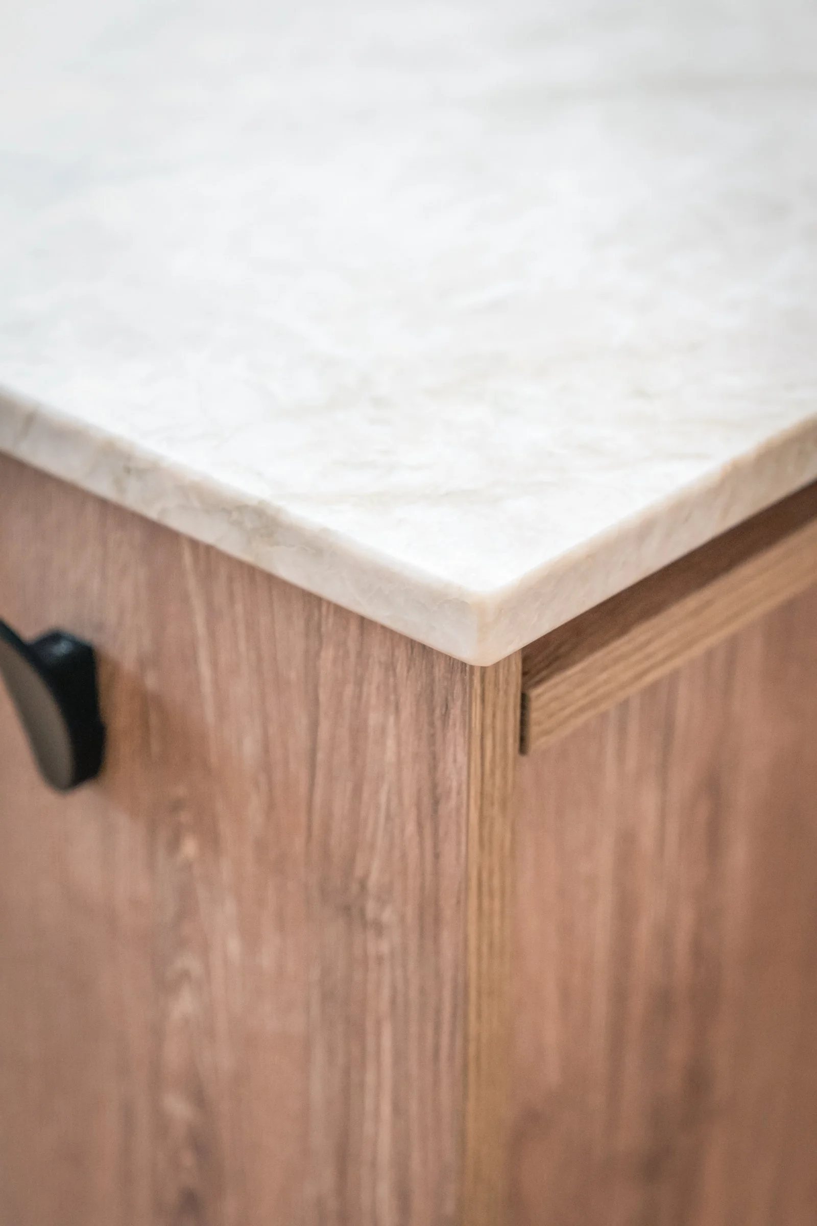
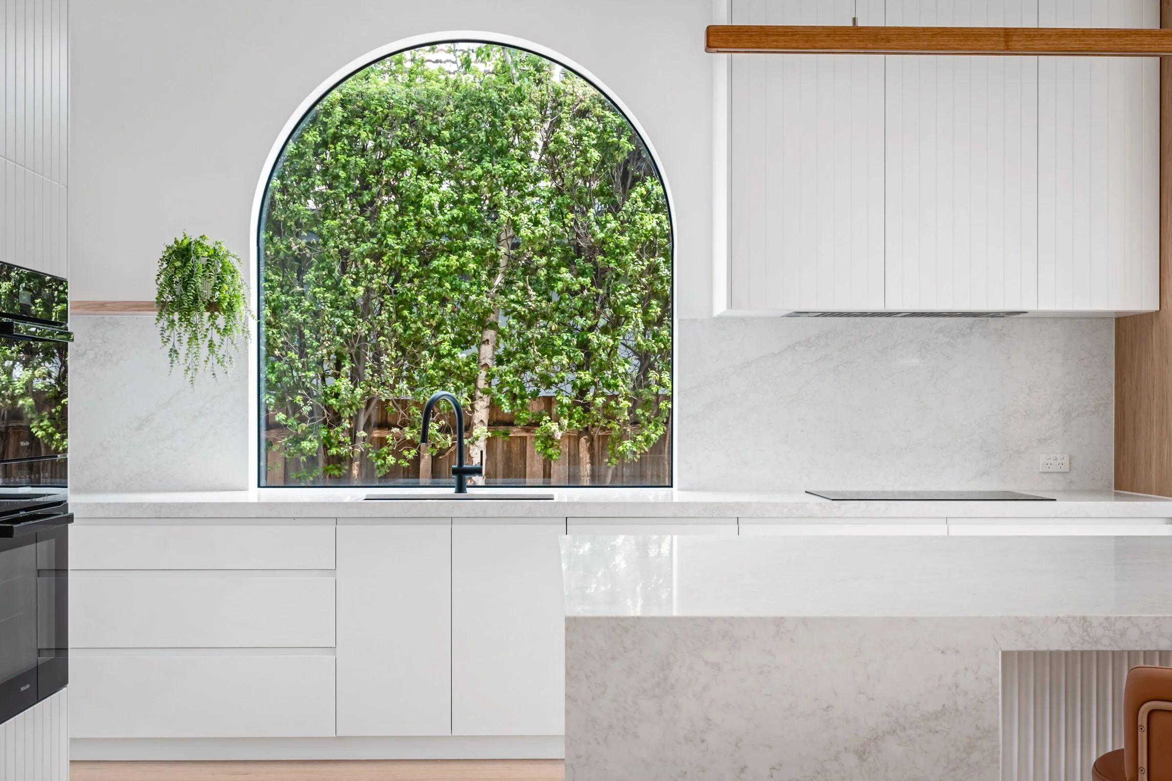
In WITNEY, Beth borrowed details from the living room to visually soften the kitchen. Oak appears in shadow lines, floating shelves and integrated fridge pulls, while VJ panelling is carried across to the fridge wall so the room feels anchored between two tall elements. The island became a true entertainer’s anchor: a little shorter but now 1.4 metres deep, with generous seating set away from the cooking side, a fluted back, soft curve and porcelain stone wrapped around the rear. It reads more like a beautiful piece of furniture than a block of joinery.
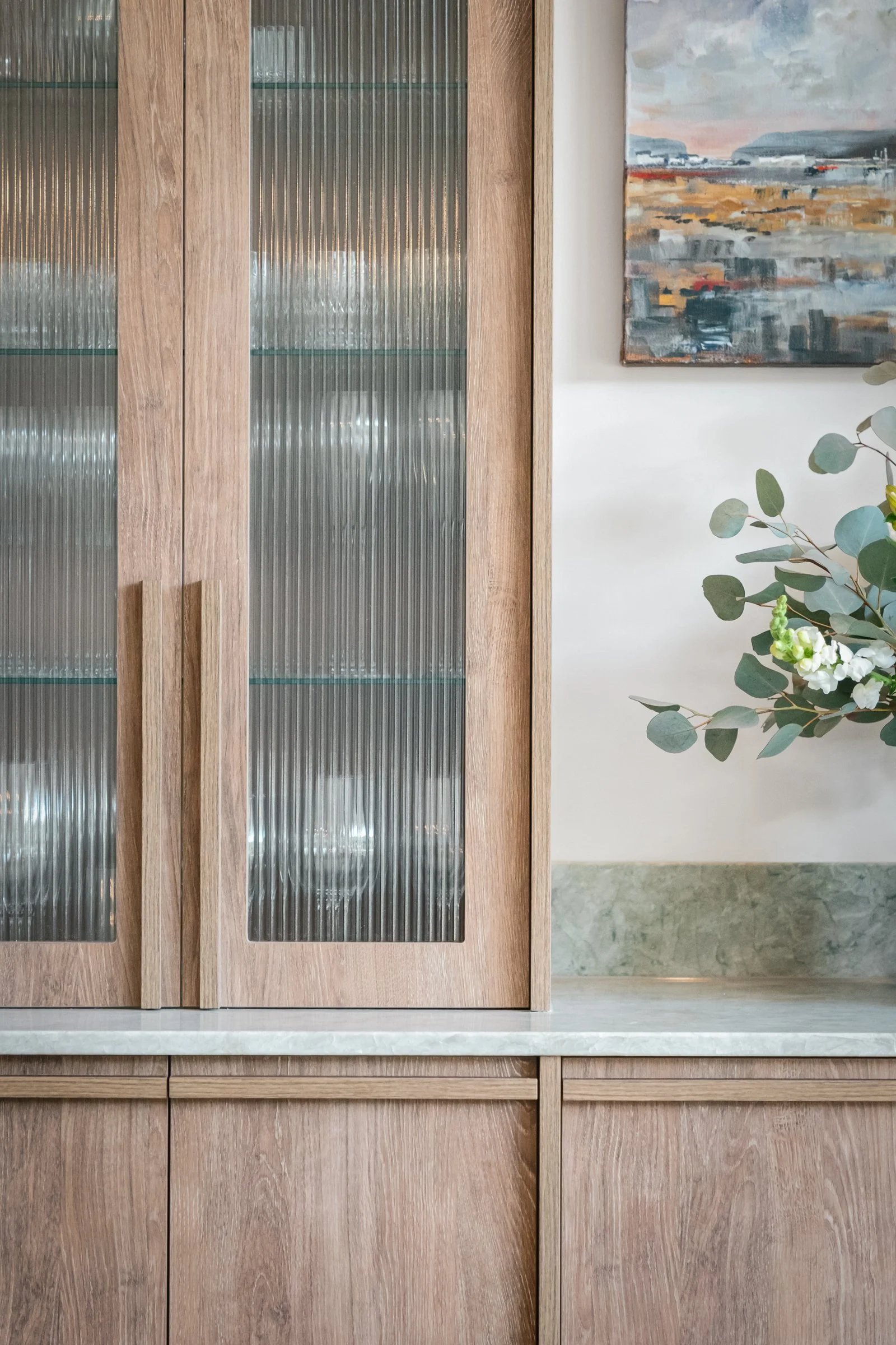
CLARE takes a similarly “furnished” approach. In the kitchen zone, tall cabinetry rises to a square-set bulkhead for a built-in, architectural feel. On the dining side, cabinetry stays lower and open above, with reeded glass cabinets, glass shelving and a deliberate “pause” for artwork. Paired with a premium timber-alternative and soft green doors with grey undertones, plus natural stone with a whisper of green, the whole space feels calm and quietly luxurious – the kind of room you’re happy to see from every angle of the home.
When your kitchen looks like part of the living space, not a row of appliances, you stop feeling like you live in a work site.
How life feels on the other side
The technical changes in WITNEY and CLARE are important – where the sink sits, how wide the island is, what the cabinetry is made from. But what really matters to the families living there is how these rooms feel.
Rushed mornings now have a defined flow instead of a scramble. Guests can gather at the island or in the dining area without blocking the person cooking. The most cluttered moments are absorbed by pantries and inserts, not left sitting on display. Light feels softer and more intentional. Small touches – under-cabinet lighting, a taller arched window flooding the sink with daylight, a hidden charging spot for the robo-vac – add up to a feeling of being quietly supported by the space.
Most importantly, the mums in these homes no longer walk into their kitchens and feel their shoulders tense. They walk into rooms that meet them where they are: busy, human, juggling a lot – and worthy of a space that helps.
If your own kitchen constantly reminds you of everything you haven’t done yet, it might not be you; it might be the room. A few thoughtful design moves can shift a kitchen from demanding more of you, to giving more back – so you can stop feeling frazzled and start feeling calm, capable and genuinely at home in the heart of your family’s life.
Behind each finished space is a Smith & Smith designer and our Rowville factory bringing every millimetre to life. Speak to a member of our award-winning team to see what's possible in your home.